Effective marketing collateral does more than inform — it persuades, engages, and leaves a lasting impression. From brochures, flyers, and sales sheets to postcards, invitations, and promotional materials, I design print collateral that is visually compelling, strategically purposeful, and tailored to the audiences and objectives it serves. This work spans corporate, public sector, nonprofit, and small business clients — reflecting a versatile approach to print design that balances creative impact with clear, audience-focused communication.
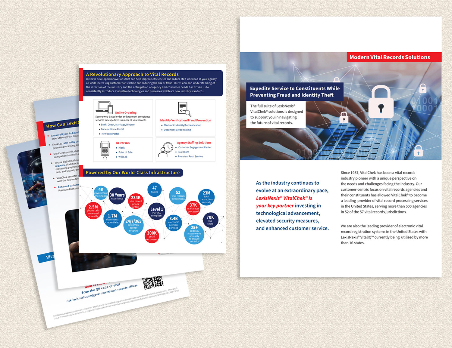
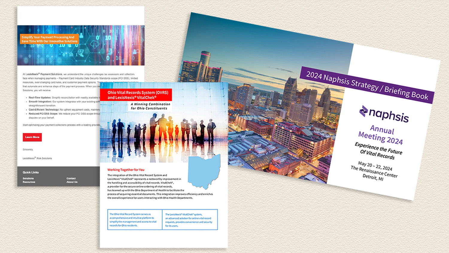
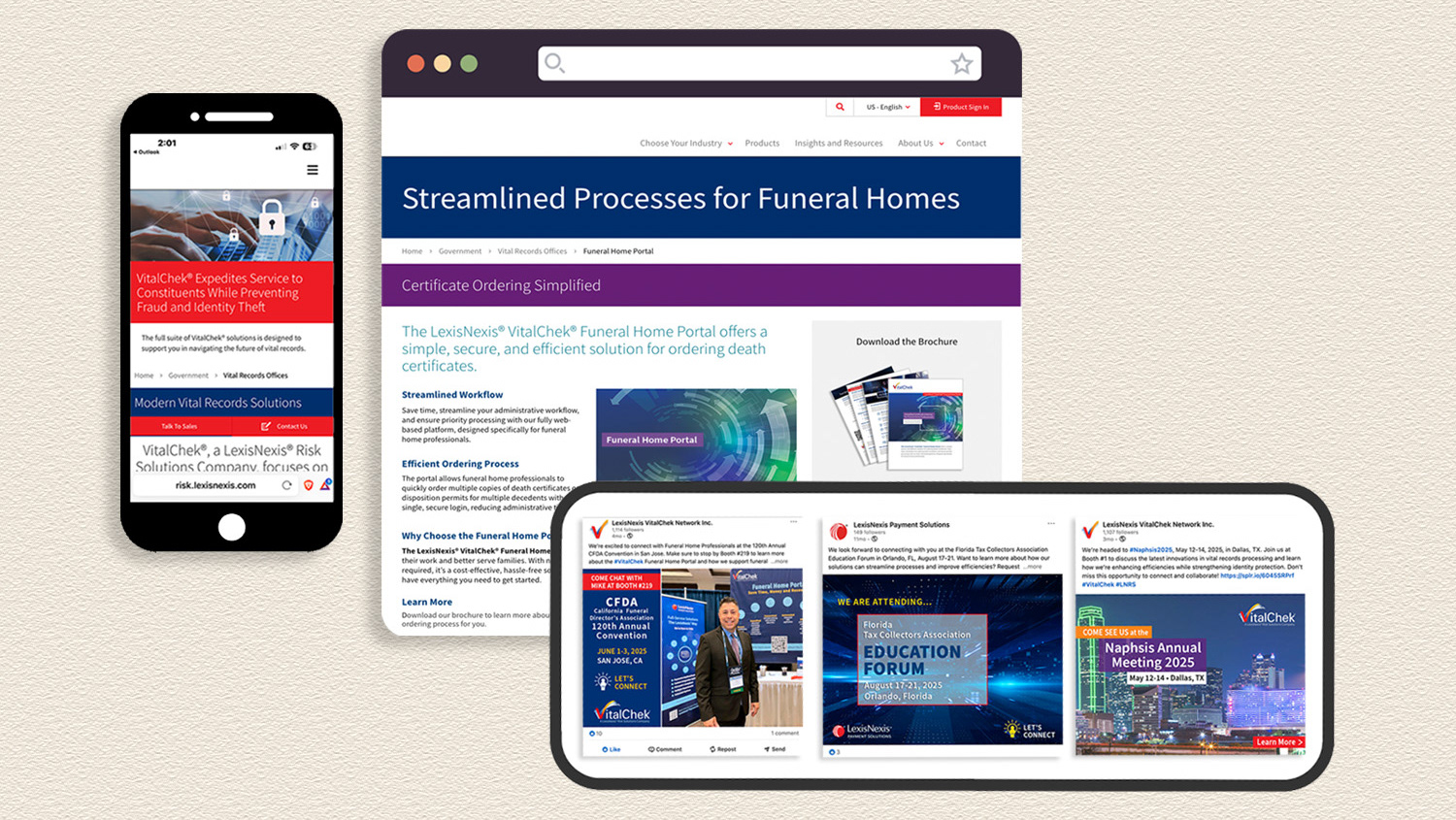
As part of the Marketing Department for a division of a global information and analytics company, I designed marketing materials to promote the company’s products and services while maintaining alignment with corporate brand standards. Each piece was developed to effectively communicate value, support sales initiatives, and strengthen brand consistency across digital and print channels.
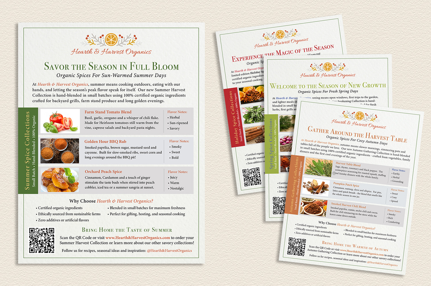
I created product flyers for a fictitious brand as part of a creative assessment, focusing on layout, typography, product storytelling, and cohesive brand execution. These pieces demonstrate my ability to quickly interpret a brief, establish a visual direction, and deliver polished marketing collateral aligned to a brand’s tone and target audience.
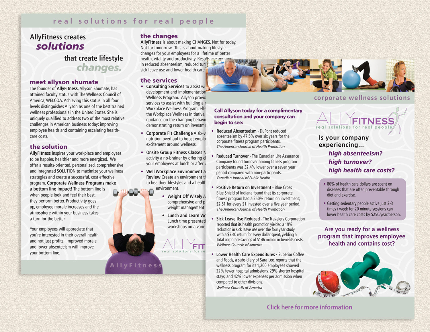
This corporate sales sheet was created to help a boutique fitness studio communicate the value of employee wellness programs to small businesses and corporations. The piece required translating the studio's services and the measurable benefits of workplace fitness into a compelling, visually engaging one-page tool that could speak directly to a business audience and drive new client partnerships. This project reflects my ability to combine visual storytelling with audience-focused messaging to produce a sales tool that is professionally polished and strategically effective.
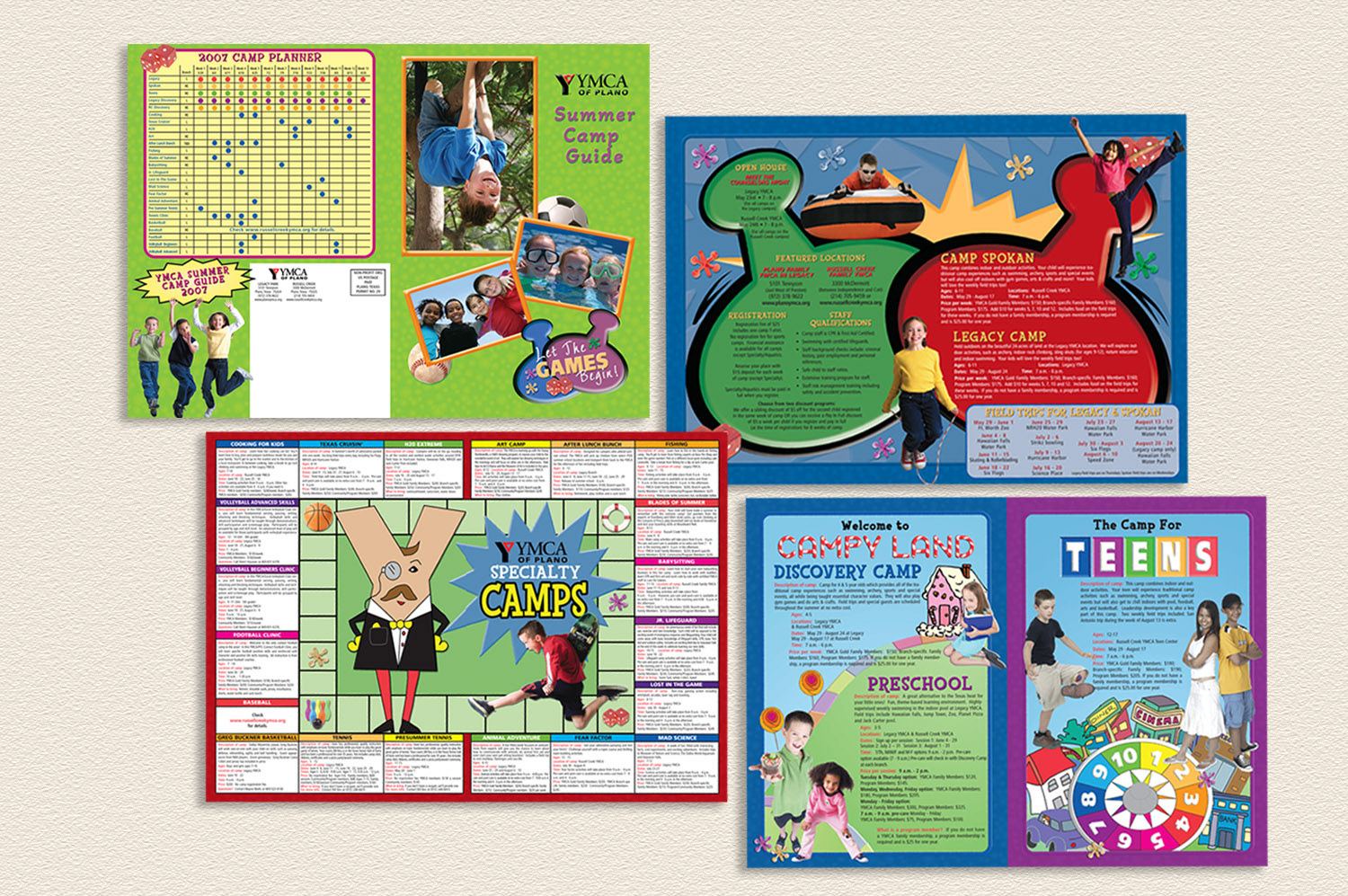
Designed for the YMCA of Plano, this summer camp guide brought the theme of "Campy Land" to life through a playful visual concept inspired by beloved classic board games — Candy Land, Life, Monopoly and Sorry. The design translated familiar game elements into a cohesive, age-appropriate aesthetic that immediately resonated with its young audience while delivering all the essential camp information parents needed. This project demonstrates my ability to develop a creative concept from a single theme and carry it consistently through an entire publication — balancing imagination, visual storytelling, and practical communication in one engaging piece.